What is colour theory?
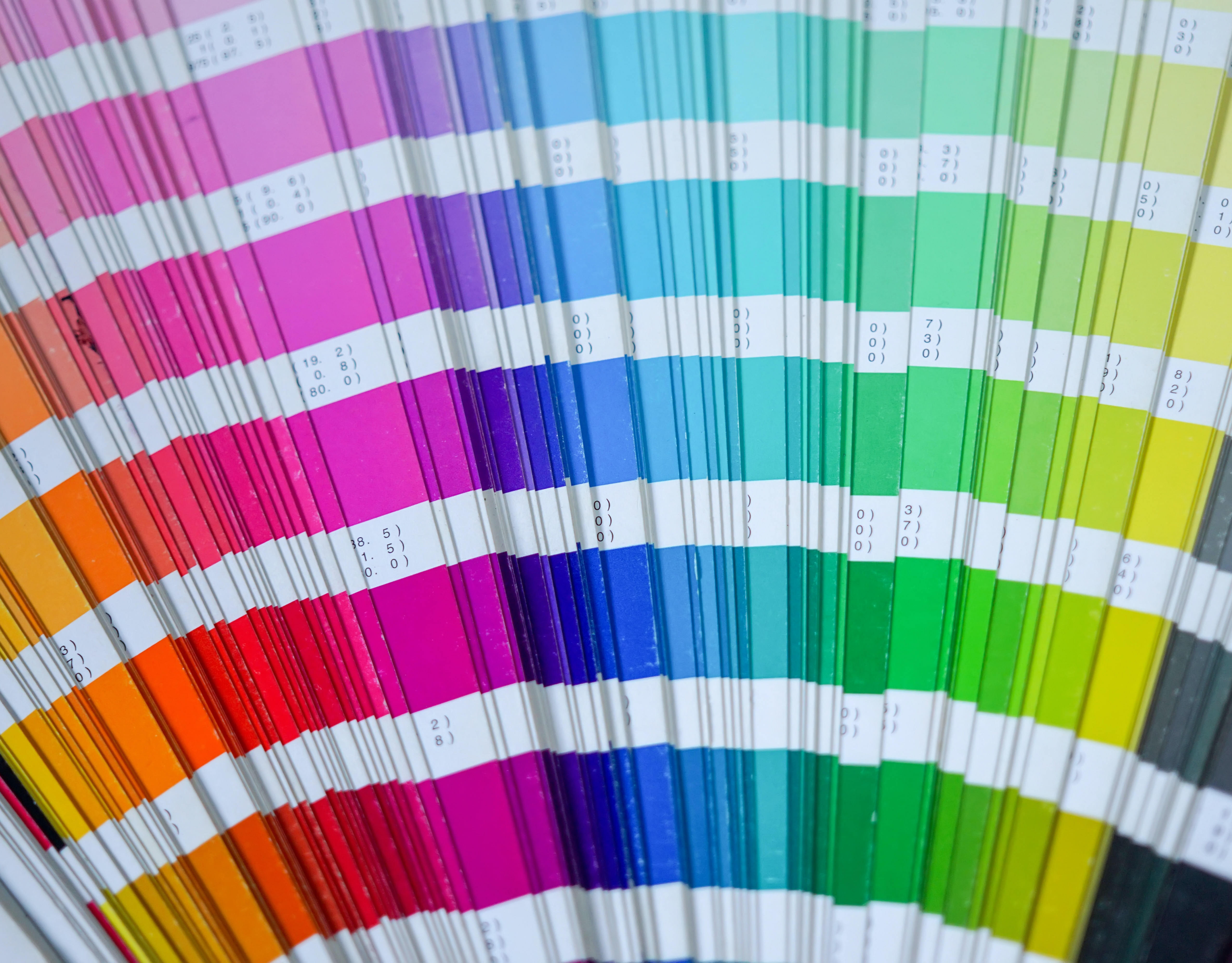
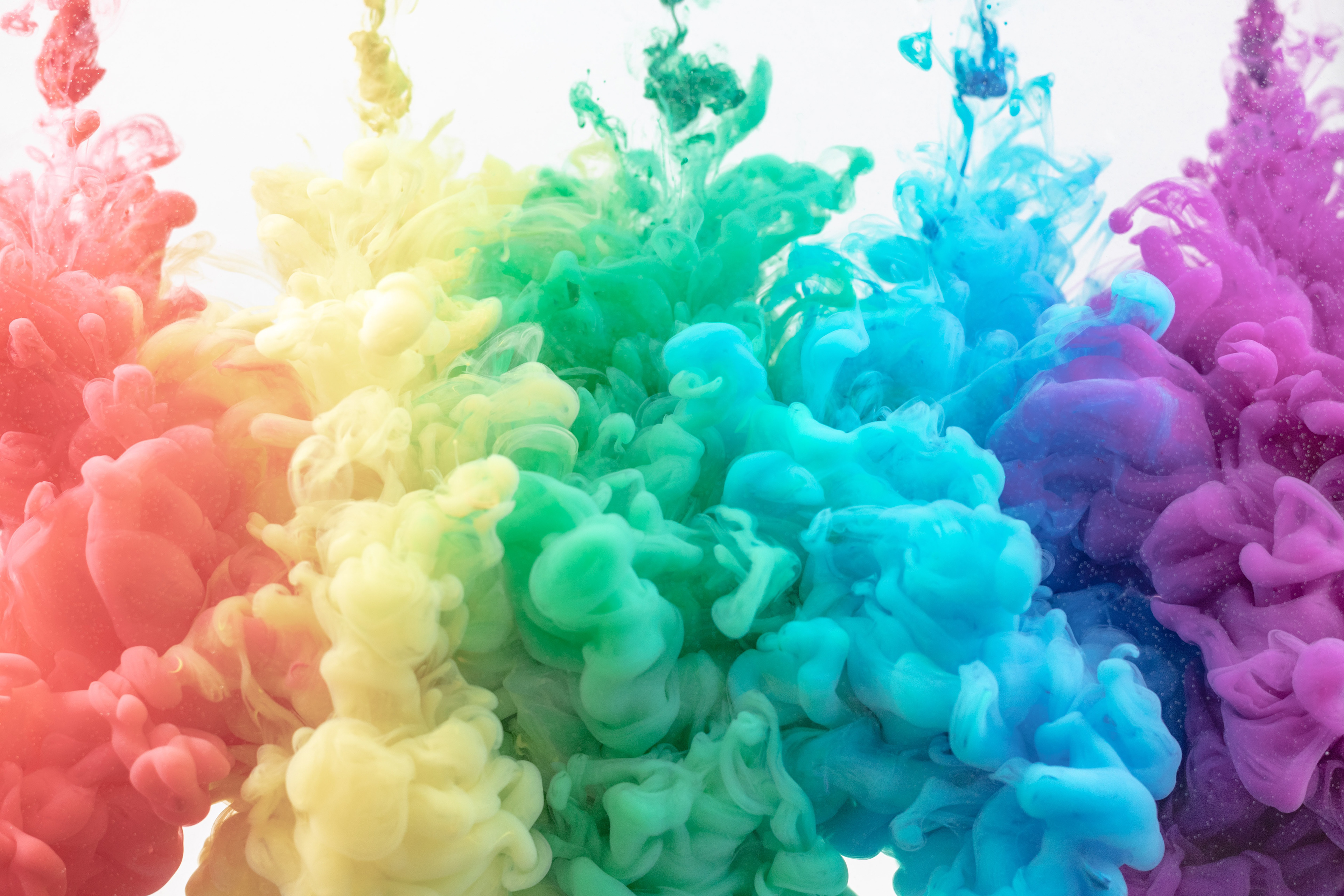
Colour theory is the foundation of all design. It's the study of how colours interact with each other and with the human eye. It's the science behind creating harmonious colour schemes, understanding the psychological effects of colour, and knowing how to use colour to its fullest potential.
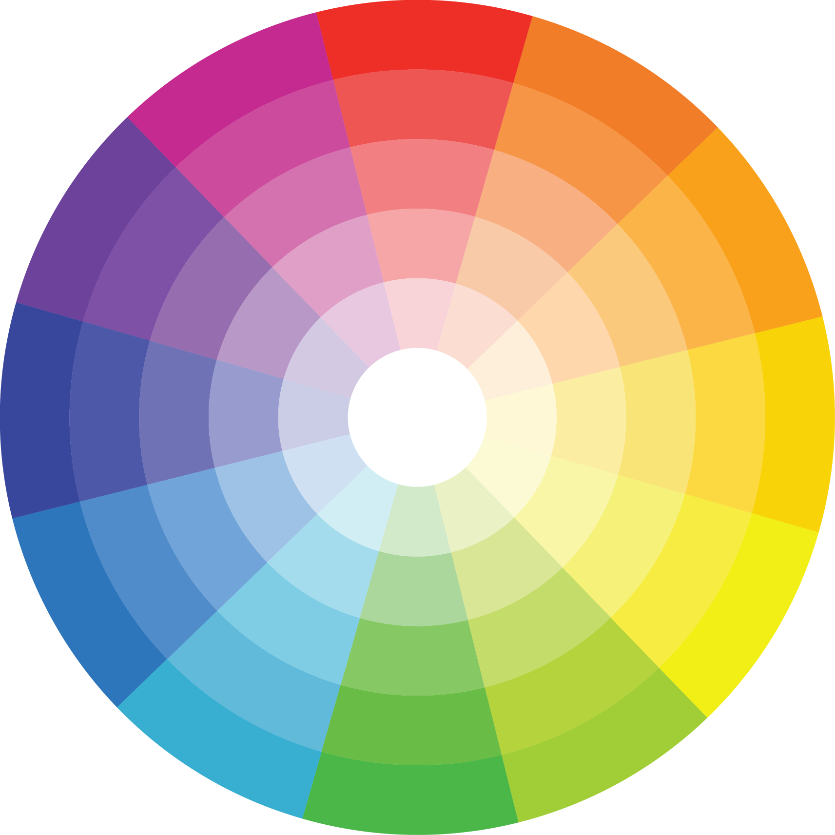
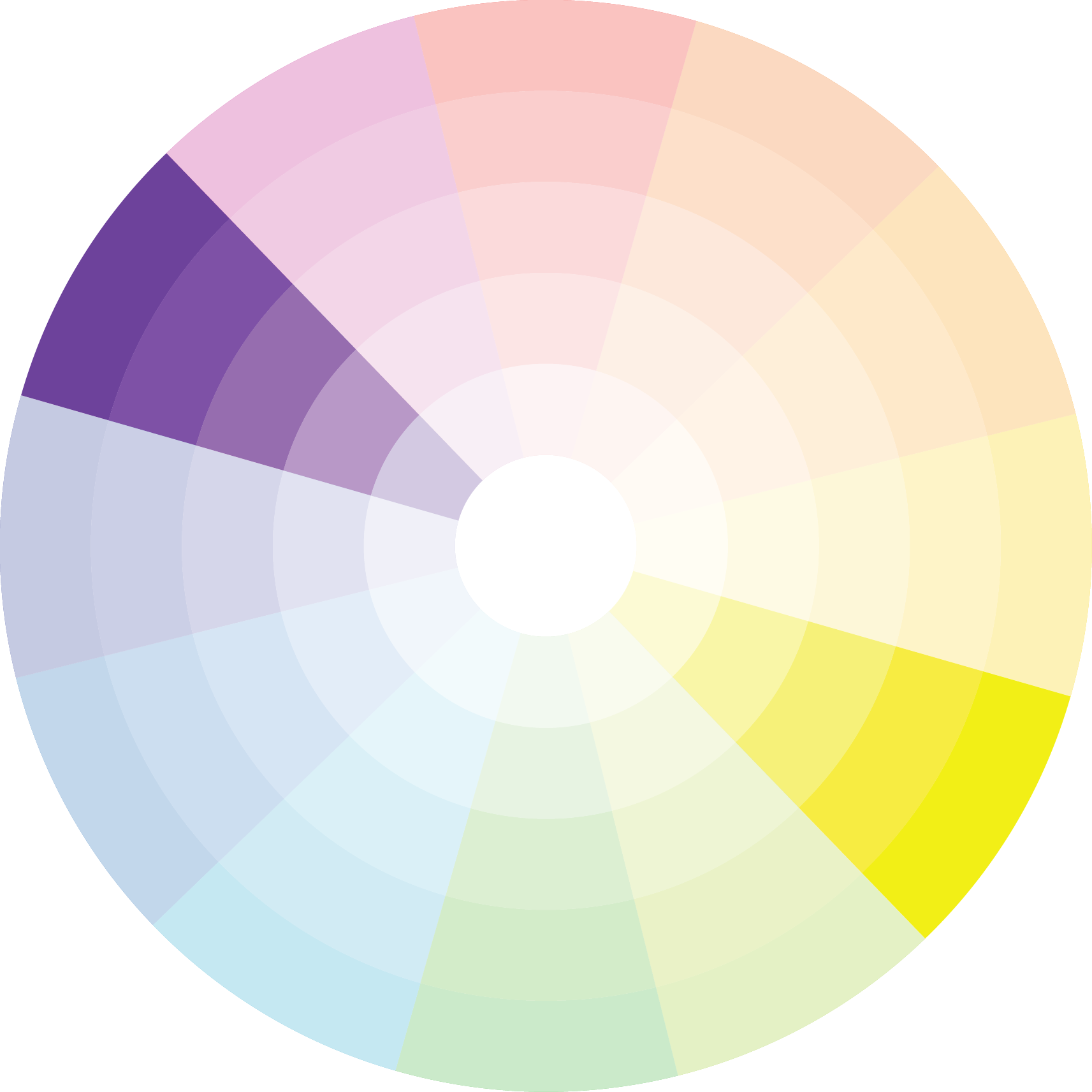
The colour wheel: The key to successful colour schemes
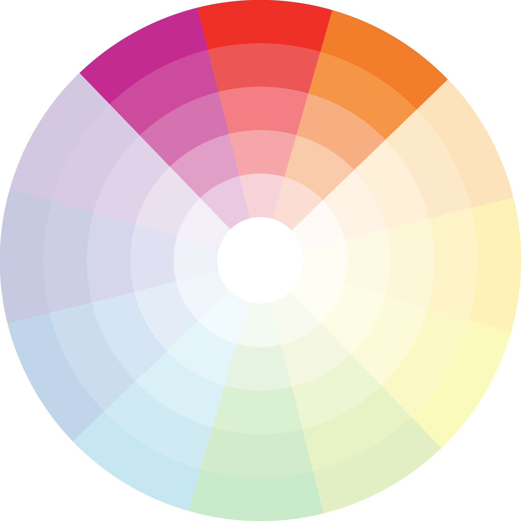
The colour wheel is the foundation of colour theory. It's the designer's ultimate tool for creating successful colour schemes. It consists of primary, secondary, and tertiary colours arranged in a circle. Primary colours (red, yellow, and blue) cannot be created by mixing other colours. Secondary colours (green, orange, and purple) are created by mixing two primary colours. Tertiary colours (yellow-green, red-orange, etc.) are created by mixing a primary colour with a secondary colour.
Colour harmony: Creating pleasing colour schemes
Colour harmony is the pleasing combination of colours in a design. It's the designer's goal to create a balanced, visually appealing colour scheme that resonates with the audience. There are several colour harmonies to choose from, including complementary, analogous, triadic, and tetradic.
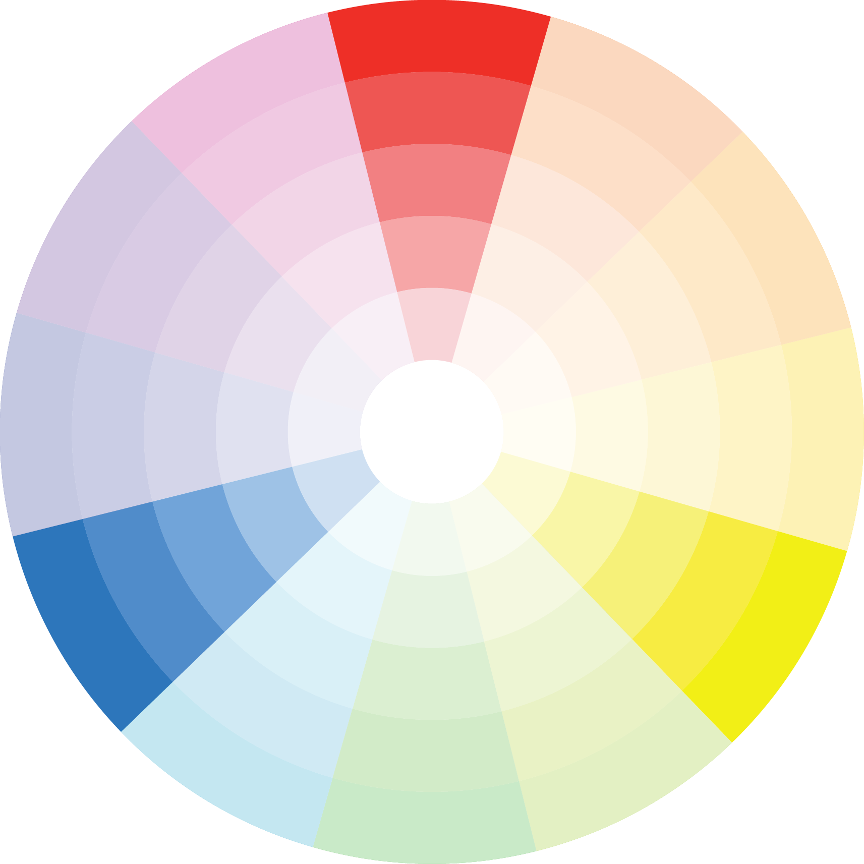
Complementary colours are opposite each other on the colour wheel. They create a high-contrast, vibrant effect that's perfect for attention-grabbing designs.
Analogous colours are next to each other on the cooler wheel. They create a soothing, harmonious effect that's perfect for designs that need to convey a sense of calmness and tranquility.
Triadic colours are evenly spaced around the collar wheel. They create a balanced, vibrant effect that's perfect for designs that need to convey energy and excitement.
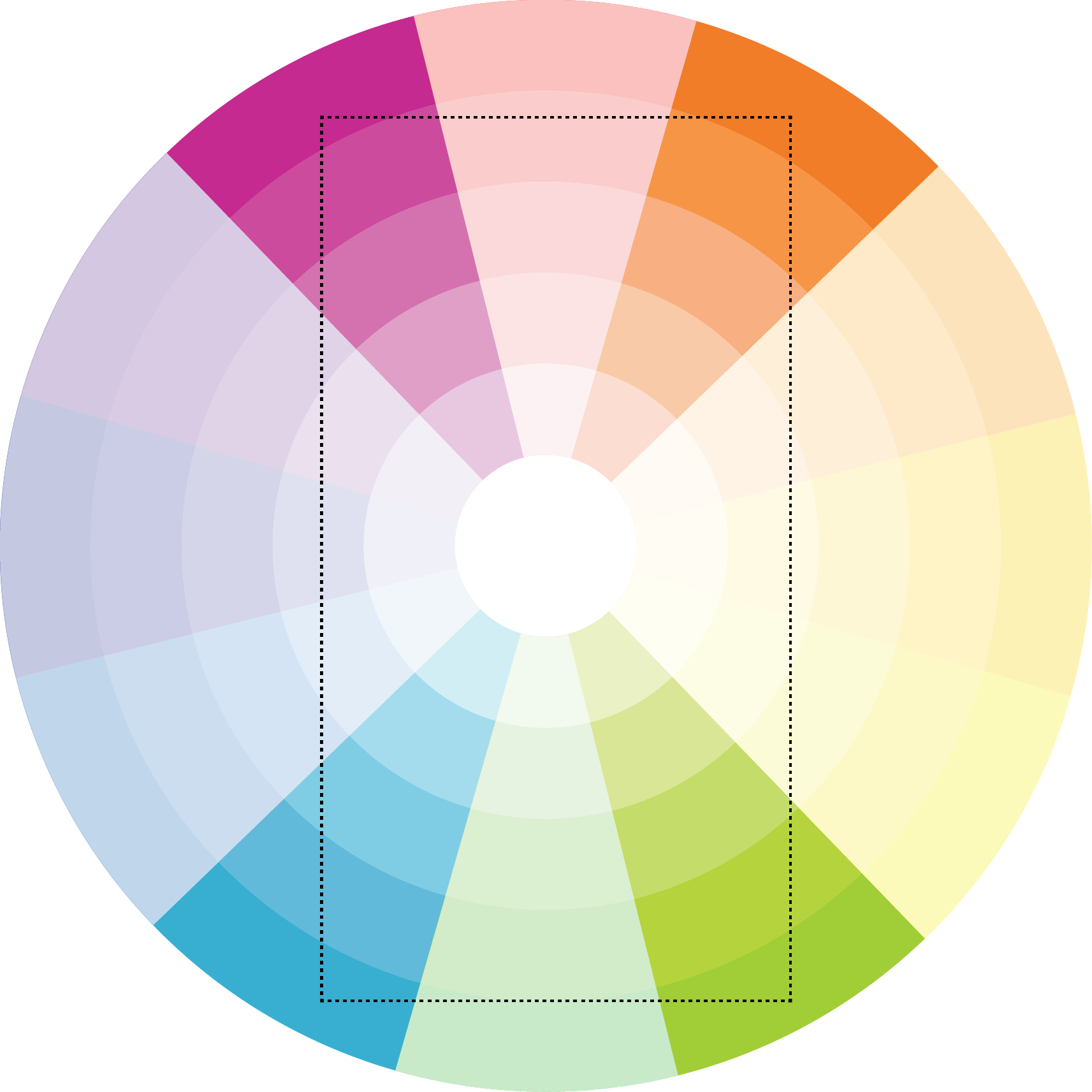
Tetradic colours are two complementary pairs. They create a complex, rich effect that's perfect for designs that need to convey luxury and elegance.
Using colour in design: Tips for success
Using colour effectively in design takes practice, but there are several tips you can follow to make the process easier:
Use colour to convey the mood and message of your design. Choose colours that support your message and evoke the desired emotions.
Limit your colour palette to avoid overwhelming the viewer. Too many colours can confuse the viewer and detract from the message of the design.
Create contrast between text and background colours to ensure readability. Use high-contrast colours to make text stand out and be easily readable.
Use colour to guide the viewer's eye and emphasise important elements. Use colour to create visual hierarchy and direct the viewer's attention to the most important elements of the design.
Experiment with different colour harmonies to create unique effects. Don't be afraid to try new colour combinations and see what works best for your design.
In conclusion, mastering colour theory is a crucial step towards creating successful designs. By understanding the basics of the colour wheel, colour harmony, and how to use colour in design, you can create visually appealing and effective designs that resonate with your audience. Remember to experiment with different colour combinations, follow the tips for success, and trust your instincts as a designer. With practice and perseverance, you can become a master of colour theory and create designs that are truly unforgettable.